Table of Contents
Free newspapers and magazines are a relatively recent phenomenon in the history of publishing: particularly popular in large cities, they enjoyed a golden age that now seems to have come to an end.
Freely distributed publications are supported by advertising: the more advertisers they manage to attract, the more pages and copies they can print. Most of us are familiar with free newspapers, which target a general, local audience and often showcase stories that are somewhat on the quirky side; less familiar, however, are the specialist magazines, which initially were distributed in specific places visited by their target readership.
This sector has spawned many innovative and creative niche publications, although many only last a few years. However, there are a few rare cases of free magazines that have thrived for well over a decade, despite focusing on subjects with limited mass appeal. In this article we will examine one of the oldest and most influential of these: Artribune.

A magazine in newspaper attire
There have always been a range of art magazines in Italy: some did not survive the advent of the digital age, while others, like Artribune, were founded when digital technology was already here, and were immediately designed with a dual focus, combining paper and web, analogue and digital.
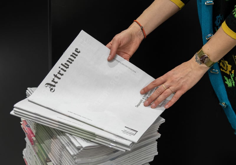
Artribune calls itself a platform for news and commentary on the art world, and is proud of its bimonthly print format. Like many other free magazines, it is distributed in places with links to its content: museums, concept stores, bookshops, cultural venues and meeting places.

The size of the magazine is interesting: it measures 245 x 320 mm, which, along with the uncoated paper and its layout, gives it a similar appearance to a tabloid newspaper.
The feeling of holding an American-style newspaper in your hands is reinforced by the name, which recalls the famous international Herald Tribune magazine, as well as borrowing the Gothic font from its header.
Quality content and ads
Artribune’s dual physical and digital nature forces the editors to create markedly different content for the two different channels: in-depth articles, explorations of individual artists and previews or reviews of major exhibitions and shows in the print version, and opinions, news in brief and information on other exhibitions and other artists online.
As with any self-respecting magazine, beautiful images are essential, particularly given that the publication deals with contemporary art.

At Artribune, this requirement is in part met by the adverts, which are the lifeblood of any free paper. Graphic designers in the newspaper world know all too well that some adverts can be garish, poorly made or simply out of sync with the magazine’s style: all that matters is that they pay. In this case, however, the advertisers are museums, art galleries and trade shows, ensuring a high level of graphic design and visual quality is maintained. Full-page ads for exhibitions or artists have the same impact as small posters.

Artribune is also interested in fields like illustration and graphic design, meaning it is often filled with a kaleidoscope of images of high artistic quality, making the magazine a pleasure to look at.
Eye-catching and interesting covers
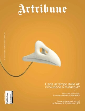
Another of Artribune’s strengths is its covers. The publication’s large format means that photos, paintings or graphics can be given the prominence they deserve. Since the magazine is distributed free of charge (with a circulation of over 50,000 copies) in places visited by people who are already interested in, or at least curious about art, the cover is vital to ensure people actually pick up the paper. It also allows users to quickly tell a new edition apart from the previous one.

Iconic covers are a dominant trend in modern magazine production, but Artribune stands apart from the rest here too, as it almost never employs the simple and popular trick of using the human face to grab attention.

The majority of its covers are abstract or conceptual, in line with the magazine’s content and style.

Simple, precise and functional graphic design
Finally, let’s have a look inside at the pages’ graphic design and layout.

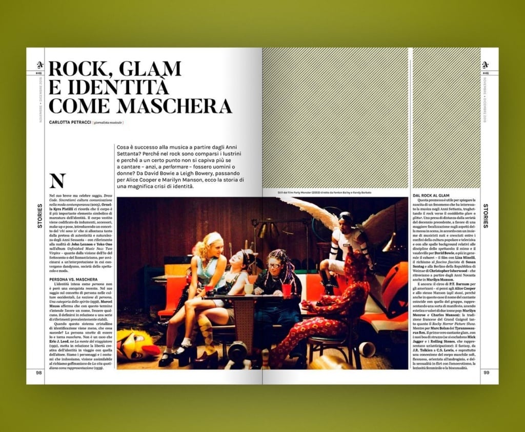
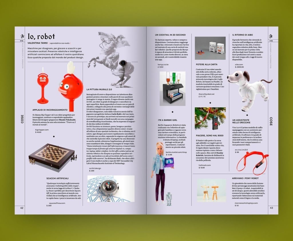
Over the years, the layout has evolved from a simple yet effective modular three-column system to a more complex design with different column styles, ranging from full-width text to three or four columns, with each page unique. This type of layout, which is challenging for the designer and sometimes makes reading more taxing, has the advantage of enabling spaces to be split up, essential for a magazine that describes lots of events, and reassembled in a balanced way when large images are used.

The lines separating the columns give it a sense of order and elegance and also recall the American tabloid concept.
Since the magazine’s 2018 restyle it uses more background colours, for example in its feature articles, called Stories, and particularly their opening pages, or to identify certain sections, particularly the Objects pages. Another interesting detail is the use of colour for the rubrics in the page margins, handy when navigating large amounts of content.

Long live quality free newspapers and magazines
The fact it can be picked up ‘on the go’ by curious passers-by and true art aficionados alike, the retro feeling of leafing through it, as if handling an object from another era (only the older generations read newspapers nowadays), the dynamic nature of the contents, and the expert and productive use of commissioned, institutional and advertising images makes Artribune an enduring project that perhaps suggests a fruitful path to follow for others seeking new approaches to distributing and accessing magazines.

Artribune proves that free magazines, when done well, with content that not only generates interest but also provokes debate, combined with plenty of attention to the graphic design and layout, are still popular and can survive in a digital world.
Another strong point is the substantial difference between the slower, more profound and attractive print version and the online portal, which means Artribune’s readers are surrounded by an information ecosystem.
All in all, long live the (quality) free paper!
All images are taken from www.artribune.it

