Table of Contents
It’s one of the most famous apples on the planet, perhaps second only to the forbidden fruit eaten by Adam and Eve. The logo of the company founded in 1976 by Steve Wozniak, Steve Jobs and Ronald Wayne is easy to understand, recognise and remember. The logo and brand name are one and the same – exactly as Steve Jobs wanted.
Today, we look back at the origins and evolutions of one of the most iconic logos the world has ever seen.
Apple: choosing the name
There are various stories out there about how Apple got its name, some with a grain of truth to them, others more urban legend. But Steve Jobs actually explained the origins of the name once and for all at a press conference way back in 1981: “I love apples and like to eat them. But the main idea behind Apple is bringing simplicity to the public, in the most sophisticated way, and that’s it, nothing else.”
According to Walter Isaacson’s biography of Jobs, the founder suggested the name to Steve Wozniak after a visit to an apple orchard at a time when Jobs was on a fruitarian diet. Jobs thought that “Apple” could be a name that was “fun, spirited and not intimidating”, and as such draw people into the IT world without frightening them. A name that would stand out in the marketplace.
The first Apple logo: Newton and the apple
The very first Apple logo, truth be told, was anything but simple. Drawn in 1976 by co-founder Ronald Wayne, it’s richly detailed, complex and didactic. The image shows the great 17th-century scientist Isaac Newton sitting beneath an apple tree and reading a book. Newton is depicted at the very moment an apple is falling on his head. It’s a nod to the legendary incident that supposedly led him to theorise the existence of gravity.
As well as the company name, the logo features a frame with a quotation from English romantic poet William Wordsworth: “A mind forever voyaging through strange seas of thought, alone”. It’s a passage that nicely encapsulates the vision of a newly born company with the ambition to revolutionise an entire industry.

Because of its excessive complexity, the first logo did not last long. For Jobs it was not modern enough, too elaborate and difficult to reproduce in small format. What they needed was a simpler image more in keeping with the company name. In his eyes, the name and logo should be one and the same.
The Apple rainbow logo: celebrating creativity
In 1977, when the company was getting off the ground, Steve Jobs asked Rob Janoff, a designer who specialised in company logos, to redesign the brand’s image from scratch: he wanted a logo that emphasised the importance of design (a hallmark of the Apple brand from the outset) and that was synonymous with the company name.
The decision to commission the redesign from Rob Janoff was inspired: the designer is a great believer in simplicity and loves logos that have “a relationship with positive and negative spaces, where something is revealed.”
And the result

A two-dimensional rainbow apple. It’s an image that is modern, immediate and easy to use. But above all, it’s a logo that says a lot about Steve Jobs’s fascination with skeuomorphism – the simplified representation of real-world elements that are presented in a form that is instantly recognisable.
Rob Janoff gave Jobs two versions of the logo, one with a bite out of it, the other without. The former was chosen for a very simple reason: so that the apple could not be mistaken for a cherry or a tomato. The bite is not, therefore, a reference to Adam and Eve’s forbidden fruit, as you could be forgiven for thinking, but an elegant visual detail that clarifies the image.
As well as “humanising” and making the logo more appealing, the colours are a nod to the first computer in the world to have a colour monitor: the Apple II. Closer inspection, however, reveals that the colours used do not follow the order of the rainbow: Jobs wanted green at the top “because that’s where the leaf was”. This colour chaos also celebrates the power of innovation to break the rules and create something new, something creative and revolutionary.
When asked how he designed the logo, Rob Janoff replied: “It was very simple really. I just bought a bunch of apples, put them in a bowl, and drew them for a week or so to simplify the shape.”
So well designed was the logo that it remained unchanged for 22 years. It’s only flaw: the colours were hard – and quite costly – to print.
From the multicolour logo to today’s logo
When Steve Jobs returned to Apple in 1997 (having left in 1985 following a power struggle with the board), the firm was on the brink of bankruptcy. Among the many challenges facing Jobs was the need to makeover the company’s image. So, in 1998, the logo was tweaked slightly: it swapped its rainbow colours for translucent blue with a glassy finish (to match the new iMac).

The same period also saw three main colour variations introduced: silver black and white.

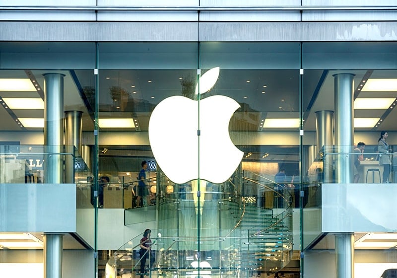
The logo was flat, modern, minimalist and elegant, perfectly in keeping with the design of the company’s products.
The Apple logo reminds us, just as Nike’s does, of the power of simplicity in design. And the lesson is the same: less is more.

