Table of Contents
When you think about typefaces, it is newspaper titles, shop signs or the fonts you can choose on your computer when creating a new document that first spring to mind. It feels like they have always existed, and we take them for granted, ignoring how much history and skill lies behind their design.
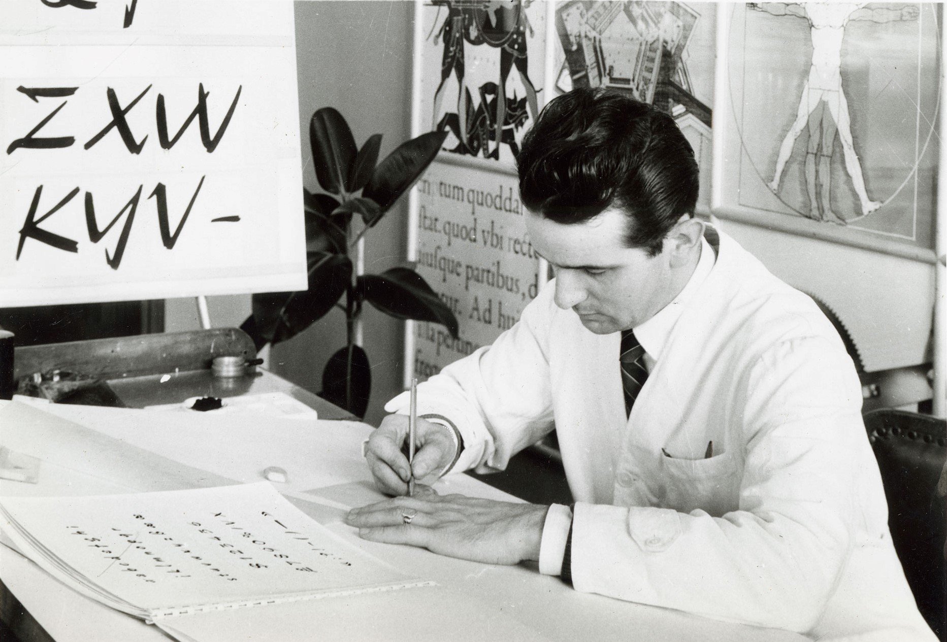
Aldo Novarese was unquestionably Italy’s most prolific type designer of the previous century. During his over fifty year career, he designed over seventy typefaces, and so doing made a big contribution to the international visual landscape between the 1950s and the 1990s.
Novarese was born on 29 June 1920 in the small village of Pontestura, in the province of Alessandria in Piedmont in north-west Italy. His family moved to Turin, where his father worked as a customs agent and where, in 1930, Aldo began his studies at the Scuola Artieri Stampatori, a printing school where he experimented with woodcut, etching and lithography. He then specialised in typography at the Scuola Tipografica e di Arti Affini Giuseppe Vigliardi-Paravia, a specialist school where he studied under the artistic director and type designer Alessandro Butti.
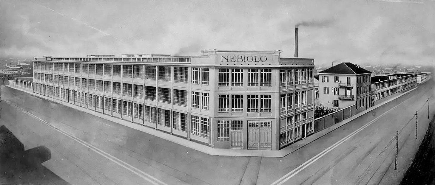
In 1936, at the age of just sixteen, Novarese began working as a designer at Nebiolo, a leading Italian type foundry and printing press Manufacturer with a history dating back to the 1500s. Butti was creative director of Nebiolo’s Studio Artistico (art studio) from 1936 to 1952, when he was succeeded by none other than Novarese himself.
Novarese’s period as creative director of the Studio Artistico was very prolific, and saw him create Nebiolo’s most renowned typefaces, which are still widely used. From the end of the war onwards Nebiolo found itself in a constantly precarious financial position, with a succession of owners. in the 1970s the iron foundry and Studio Artistico closed down, and in 1978 (under the ownership of FIAT), the entire company was declared bankrupt. However, Novarese continued his typeface design work, working independently and creating designs for foundries and distributors across Europe until his death in 1995.
Classification of typefaces
Inspired by the system created the previous year by Maximilien Vox, in 1956 Novarese formalised a system for classifying typefaces, which was published in 1964 in his book Alfa-Beta. In this system, typefaces were divided up into ten categories based on the history and stylistic features.
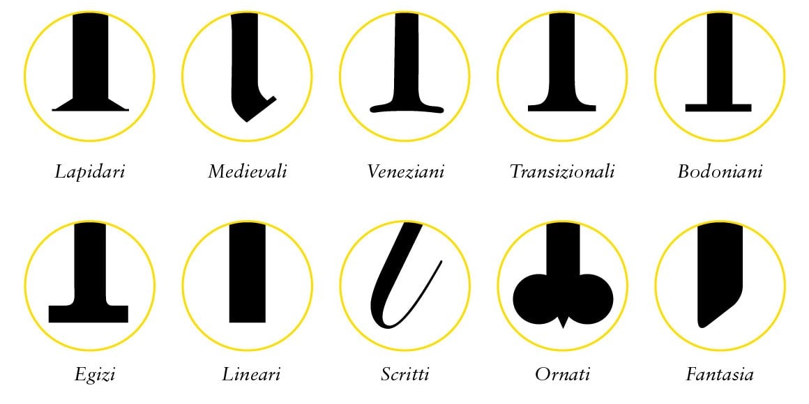
LAPIDARI (LAPIDARY): originating in ancient Rome and used for epigraphs and inscriptions, with triangular serifs.
MEDIEVALI (MEDIEVAL): also known as Gothic typefaces, these are typical of the medieval period and have sharp, contrasting forms.
VENEZIANI (VENETIAN): of Roman origin but with rounded serifs and strong contrast between the stems.
TRANSIZIONALI (TRANSITIONAL): from the transition between ancient Roman and modern Roman, with highly contrasting stems.
BODONIANI (BODONIAN): an extremely marked contrast between the stems and right-angled serifs.
EGIZI (EGYPTIAN): Geometric characters with little contrast and right-angled serifs.
LINEARI (LINERA): sans-serif typefaces.
SCRITTI (HANDWRITING): also known as calligraphic, these imitate handwritten text and can be joined or unjoined.
ORNATI (ORNAMENTED): these have very obvious decorations, and are often used as initials.
FANTASIE (FANCY): typefaces that do not fall under any of the previous headings, often eccentric or peculiar.
His best-known typefaces
Aldo Novarese designed more than 70 typefaces (over 200 if one includes variations in size and weight), with the majority created for Nebiolo. Many of these fonts are still widely used. Let’s have a look at some of the most famous and representative examples.
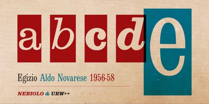
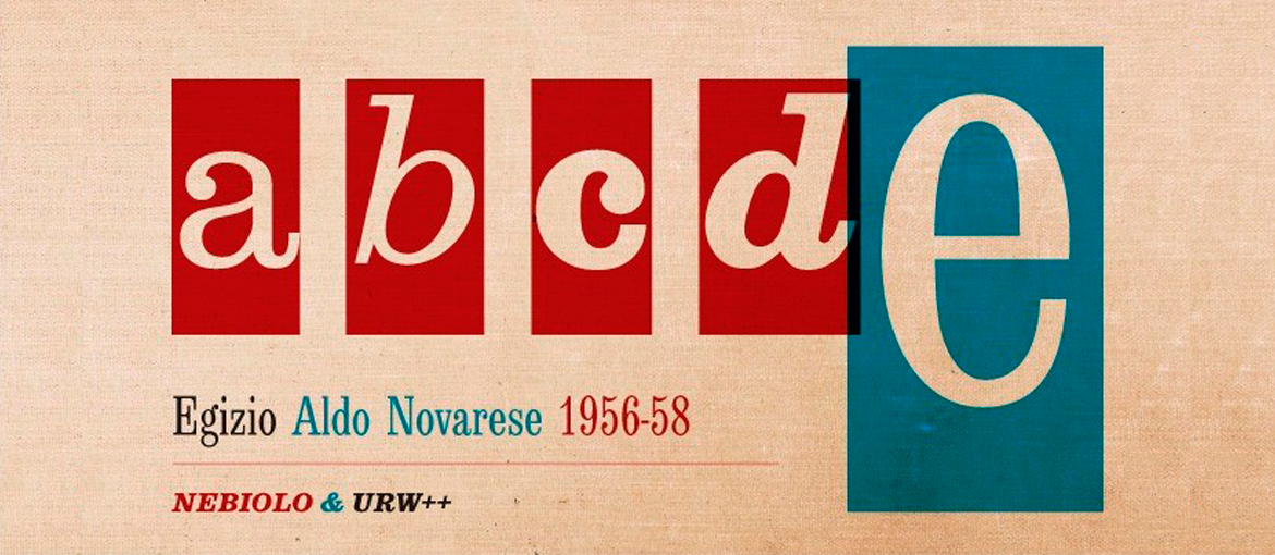
Egizio is a typeface designed for Nebiolo and released in 1958. As the name suggests, it is a geometric typeface with right-angled serifs. A digital version was created by the URW++ foundry in 2009.
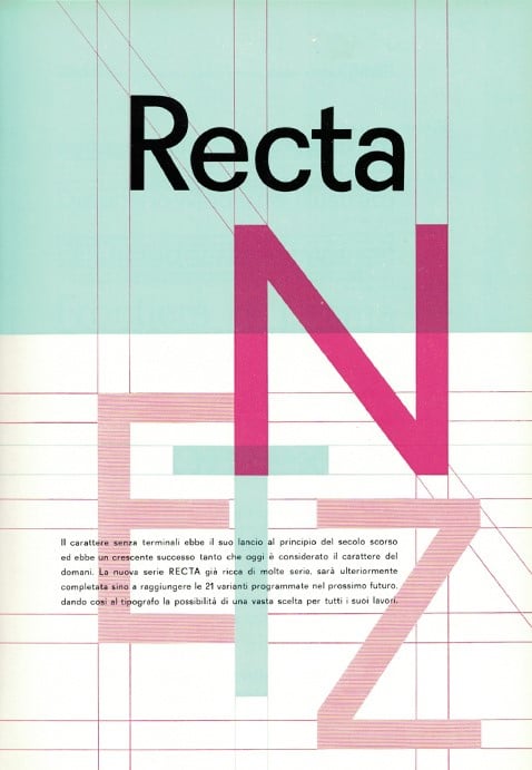
Recta was also created in 1958, designed by Novarese based on drawings made by Butti many years earlier. It is a sans-serif font, and is considered the Italian Helvetiva. It has been digitalised by Canada Type.
Eurostyle is perhaps Noaverese’s and Nebiolo’s best-known typeface. Designed in 1962, it was widely used across the world, often for logos. This geometric and modern sans serif is available in a digital format from Linotype.
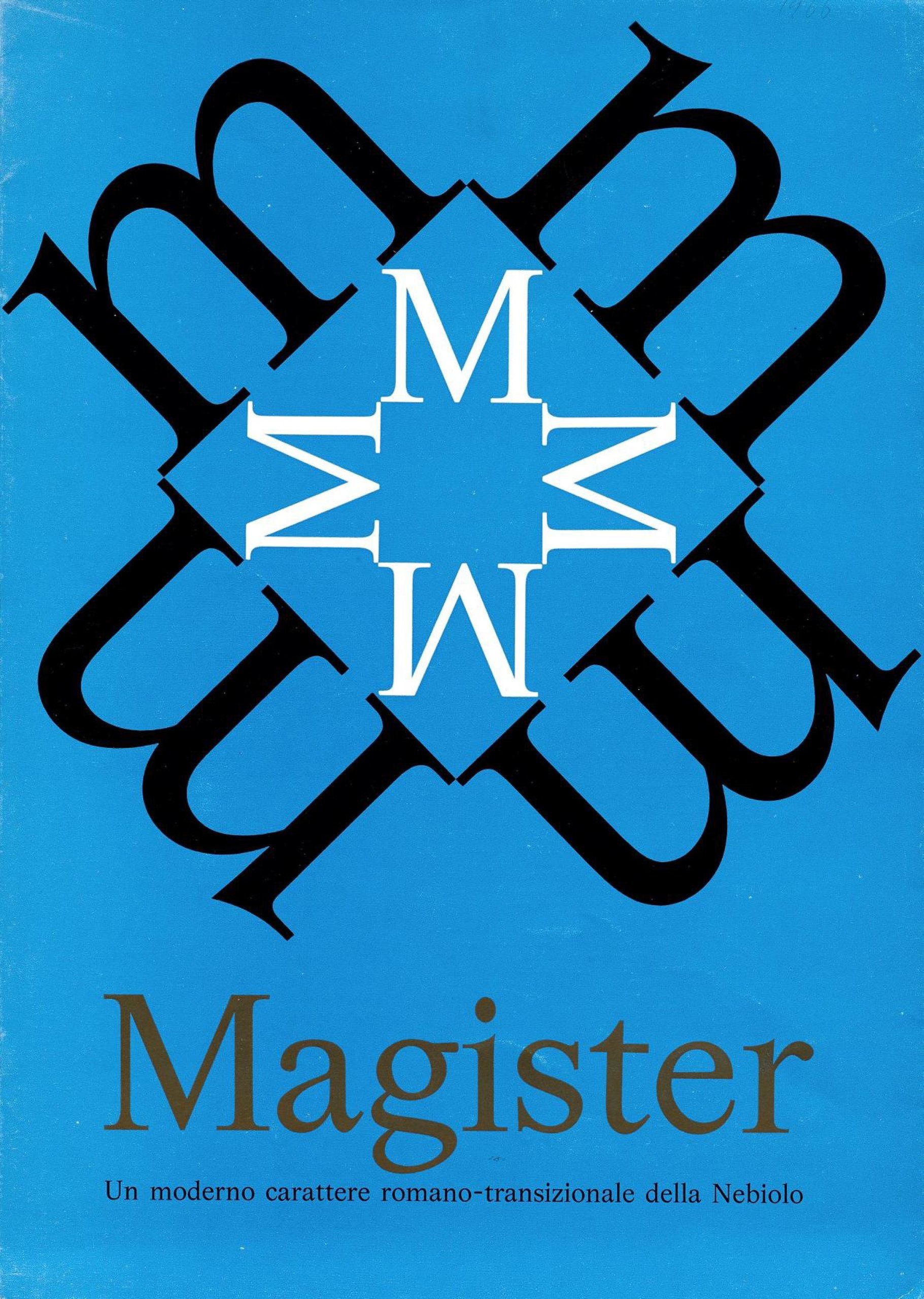
Magister, a transitional font published by Nebiolo in 1966, has had various digital revivals, but the most accurate version was produced by Omnigroup.
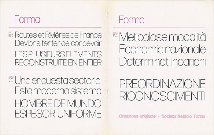
Forma was created with the aim of producing a typeface that was ‘objective and universal’. First published in 1968, it was designed by a team of talented Italian designers led by Aldo Novarese (the others were Franco Grignani, Giancarlo Iliprandi, Bruno Munari, Ilio Negri, Till Neuburg, Luigi Oriani and Pino Tovaglia). DJR has created a commercial version with slightly rounded corners, while Tankboys designed Forma Nuova, a version that is closer to the original design.
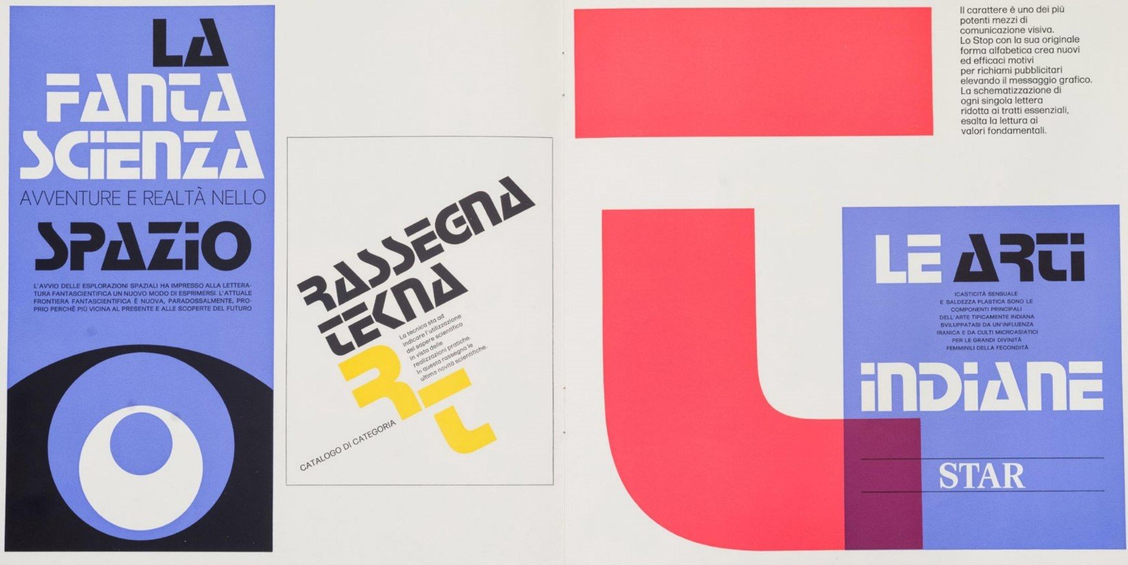
Stop is a display typeface with a futuristic appearance. Released by Nebiolo in 1971, it is often seen in both digital and printed contexts. It is available in digital format from Linotype.
The reissue of Alfa-Beta
In 1964 Novarese produced a book entitled ‘Alfa-Beta: The Study and Design of Type, published by Progresso Grafico and distributed by the publishing house G.B. Paravia & C. The volume takes readers on a journey through the evolution of writing and typography from its origins through to the period in which the text was written, and presents the classification of typefaces the author devised in 1956.
Alfa-Beta is one of the few works in the history of typography produced in Italian, and is one of very few to have been written by a type designer and not by an historian or scholar.
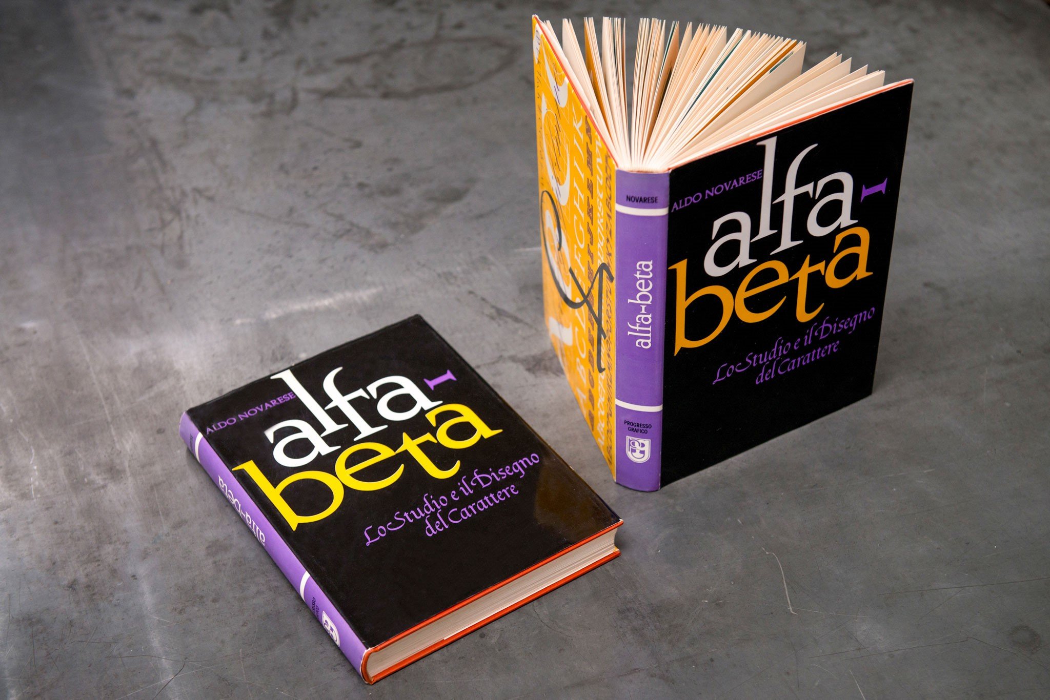
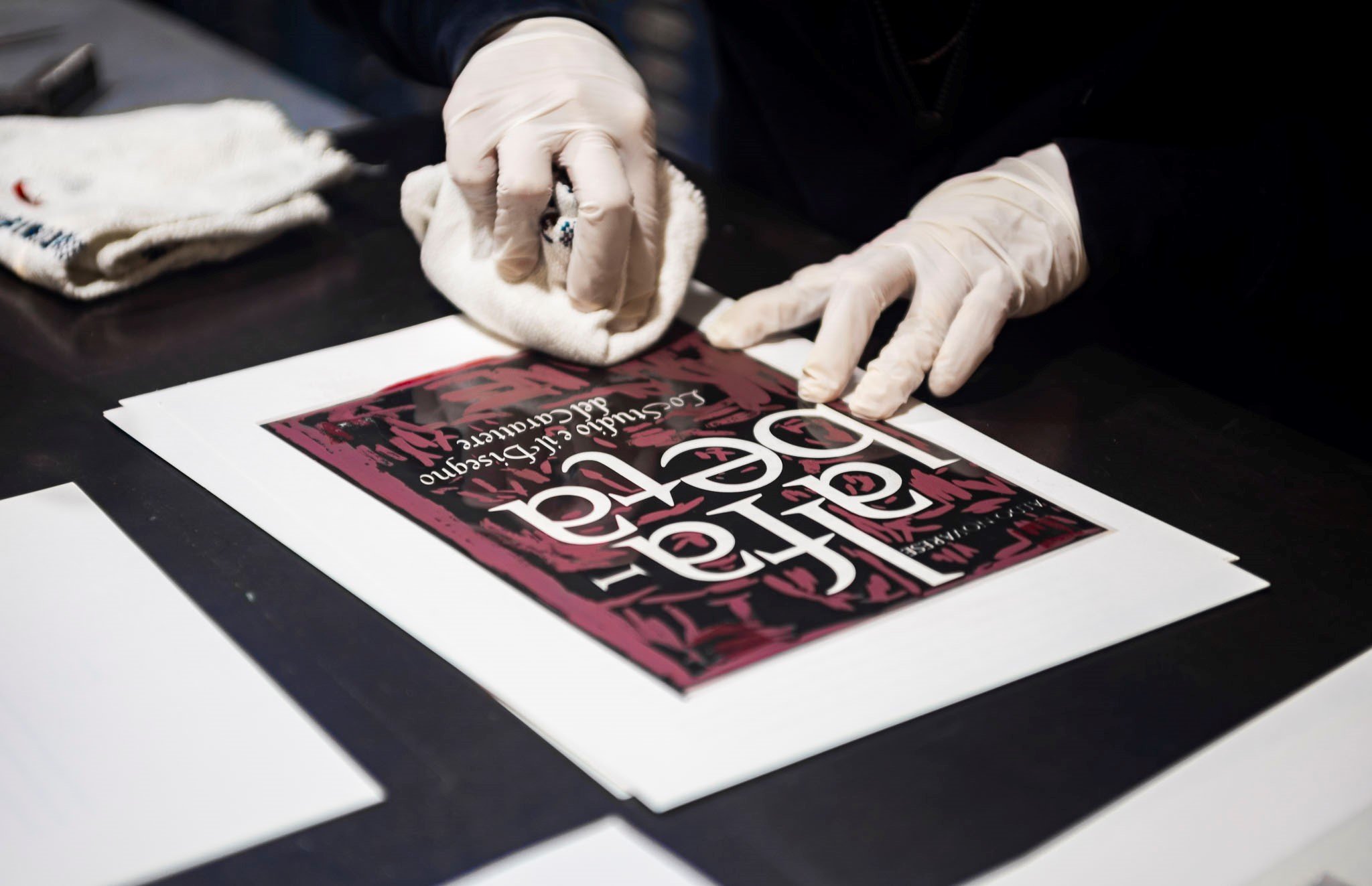
Archivio Tipografico is an active and collaborative space for studying, conserving and continuing the art of typography. In June 2020, this Association launched a crowdfunding campaign to reissue the book. The project received a lot of support, which will allow extremely important work Italian graphic design to be enjoyed more widely.
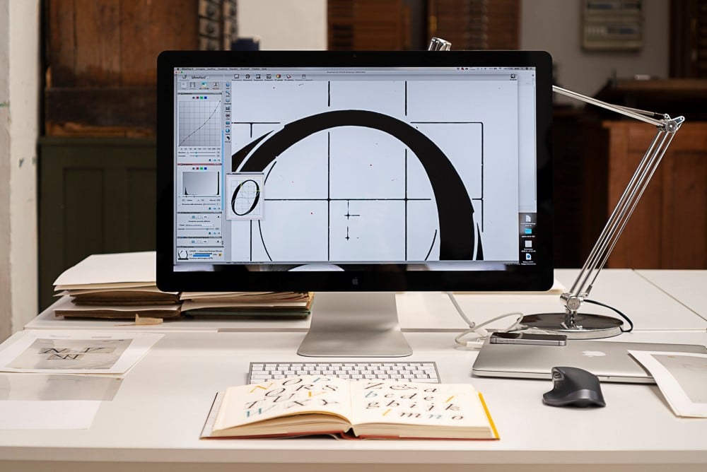
“The centenary is the ideal occasion to create a reprint that is faithful to the first edition, using original material, newly restored and digitalised, which aims to obtain results as faithful as possible to the original. This edition will also feature a new introduction, contextualising the books original release, highlighting its current relevance, and describing the editorial logic guiding the issue,” —Archivio Tipografico
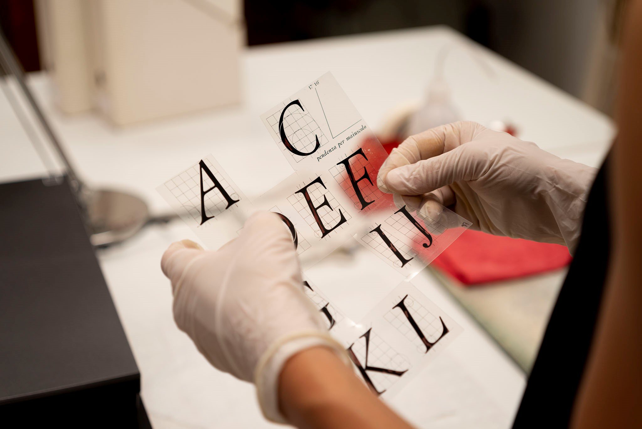
It therefore seems that 100 years on from his birth, Novarese is being rediscovered. Thanks to this book, the designer will become better known for his wide-ranging typography work, including among young designers the world over, who will be able to draw on Novarese’s exceptional work for inspiration and to underpin their professional work.

